White kitchens have set the standard in design publications and Williamson County remodels for the better part of a decade. They are clean, bright and reliably beautiful. But the kitchens that are generating the most conversation in Franklin and Brentwood right now are the ones that have moved past the all-white default and into something more personal and more considered.
Color is no longer an accent element tucked into a backsplash or a piece of decor. It is becoming the foundation of the entire kitchen design. Homeowners want kitchens that feel warm, layered and genuinely expressive rather than something that could belong to anyone. The shift is away from kitchens that look like showrooms and toward kitchens that feel like homes.
These ten kitchen color trends represent the directions shaping the most refined remodels across Williamson County right now, along with practical guidance for bringing them into your own kitchen, the same range of direction on display throughout our kitchen remodel portfolio.
1. Deep Greens That Feel Grounded and Natural
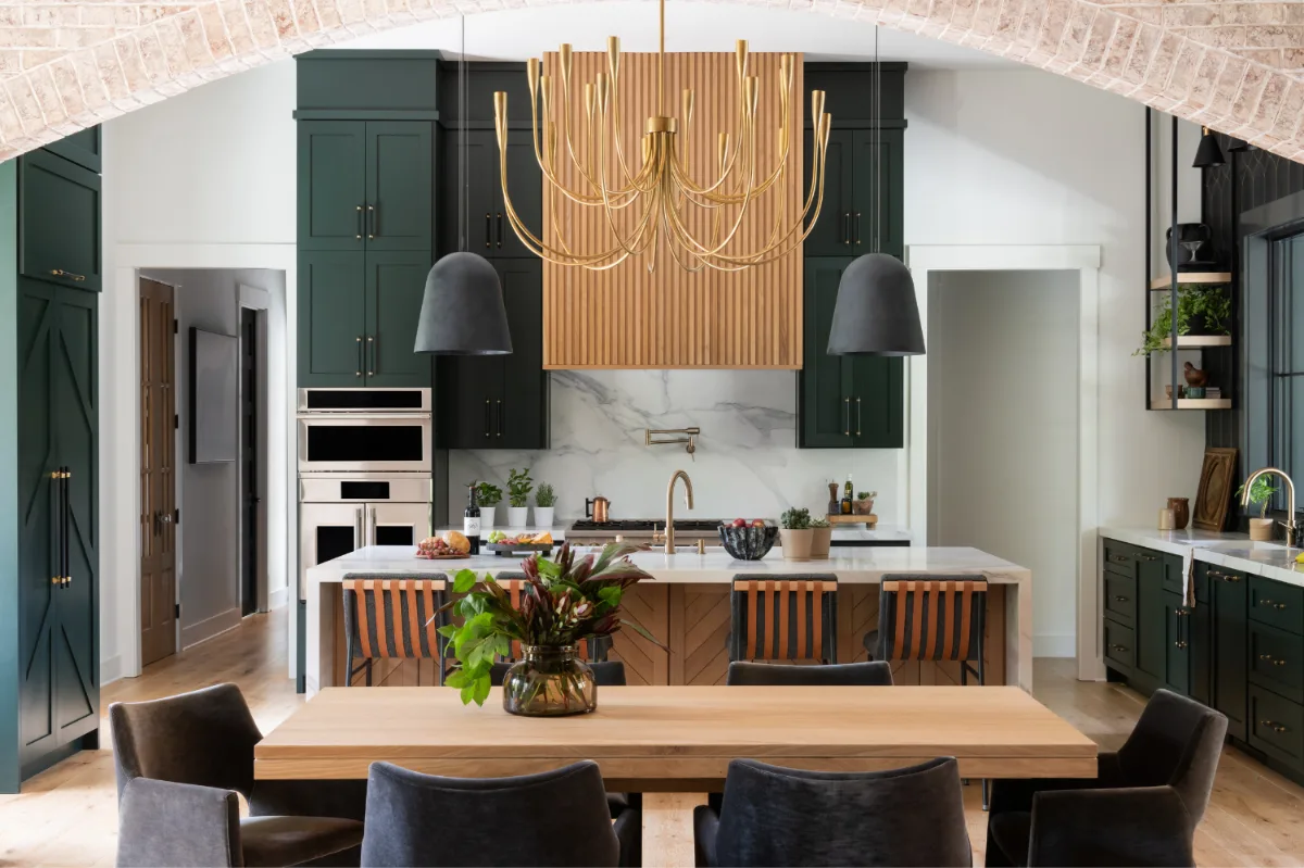
Green is having a significant moment in kitchen design, particularly the deeper, more saturated shades: forest green, olive, hunter green and the earthy, almost-black tones that fall between green and charcoal. These colors bring a calm, grounded quality into the kitchen that lighter, cooler palettes cannot replicate. They feel connected to the natural materials and outdoor environments that so many Franklin and Brentwood homes are designed to reference.
Deep green cabinetry works especially well in kitchens with generous natural light, where the sun softens the richness of the color and keeps it from reading as heavy. In kitchens where the footprint is more contained, using deep green on the lower cabinets or the island introduces the direction without committing the entire room to it.
The material pairings that work best with deep green are the warm and honest ones: unlacquered brass hardware, white oak shelving or open-shelf accents and honed quartzite or Calacatta marble countertops with warm veining. These combinations allow the green to read as grounded and sophisticated rather than trendy.
2. Moody Blues That Add Sophistication
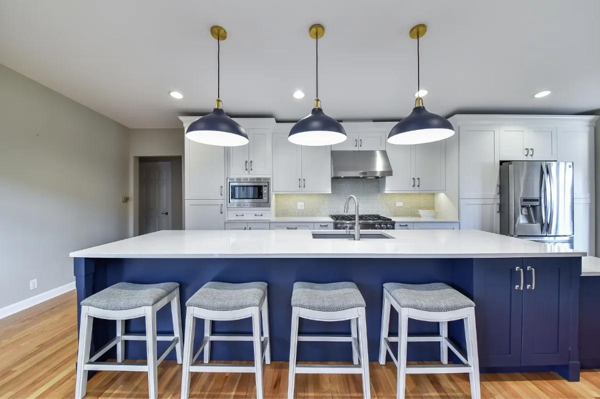
Blue has always been a safe kitchen color choice, but the version appearing in the most refined Williamson County kitchens is a different category entirely. Ink, slate, deep sapphire and blue-black are being specified on cabinetry that aims for the kind of composed, elevated quality more commonly associated with dining rooms or primary suites than kitchens.
These deeper blues bring structural calm to the space. They work particularly well in larger kitchens where the depth of the color does not compress the room. A common and effective approach is moody blue lower cabinets with lighter or open-shelf upper cabinets, which maintains visual weight at the base where it belongs while keeping the room open above eye level.
Finish choice matters significantly with deep blues. A matte or eggshell finish produces a soft, modern quality that reads well in natural light. A slight sheen introduces more dimension and reflects light more actively, which works well in kitchens that rely more on artificial lighting. Polished nickel and unlacquered brass both pair beautifully with moody blues, offering either a clean contrast or a warm complement depending on which direction the overall palette is taking.
3. Warm Neutrals Replacing Cool Grays
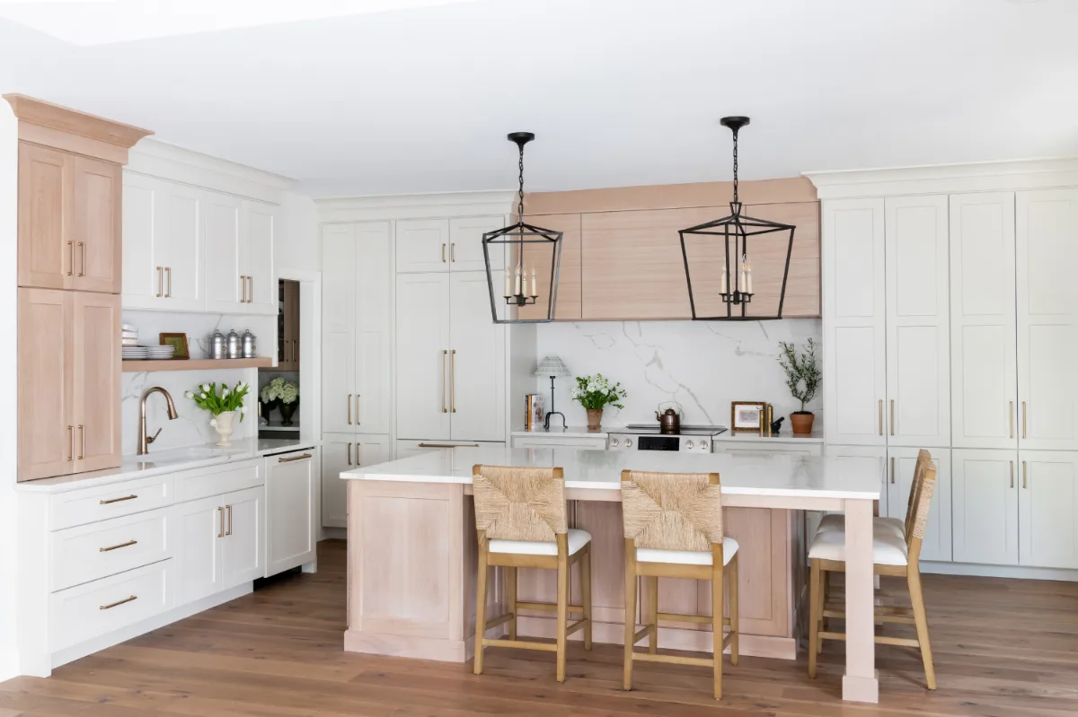
The cool gray kitchen had its decade. What is replacing it across Franklin and Brentwood is warmer: beige, taupe, greige, soft clay and the full range of tones that sit between white and warm brown without committing to either. These colors feel genuinely inviting rather than simply neutral, and they age more gracefully than cooler grays as design cycles continue to shift.
Warm neutrals are particularly versatile because they function as a foundation rather than a statement. They allow natural materials, warm wood accents, stone countertops and textured hardware to read clearly without competing with the wall or cabinetry color. In a kitchen with honed quartzite countertops and white oak flooring, a warm greige on the cabinetry allows those materials to do the visual work while still providing a cohesive, clearly designed backdrop.
The longevity case for warm neutrals is also meaningful. They provide a backdrop that can absorb updates in furniture, hardware and textiles without requiring a full repaint. That flexibility makes them one of the most practical color decisions a homeowner can make in a kitchen remodel.
4. Rich Wood and Charcoal Combinations
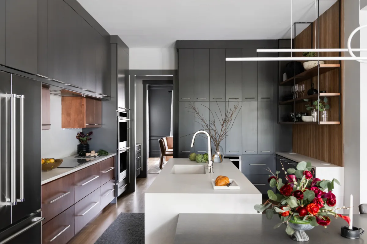
The combination of warm wood tones with deep charcoal or graphite cabinetry has become one of the most consistently requested directions in Williamson County kitchen remodels. It is architectural, high-contrast and entirely grounded in natural materials, which makes it both visually compelling and genuinely durable as a design direction.
The contrast between warm wood and cool dark cabinetry creates depth without relying on bold color. It reads as calm and considered rather than dramatic. Flat-panel charcoal or graphite lower cabinets keep the look clean and contemporary, while white oak elements, whether lower cabinets, open shelving or vertical paneling at the range, introduce warmth and texture that softens the overall palette.
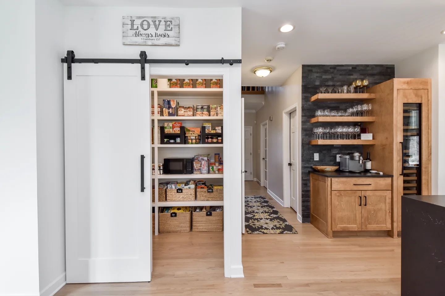
This combination works particularly well with light or white countertops, which provide the visual reset between the wood and charcoal tones. Integrated appliances and simple hardware keep the design streamlined. Repeating the wood tone in two or three specific locations, open shelving in walk-in pantry inspiration, the island waterfall edge, or a paneled hood, creates cohesion without uniformity.
5. Matte Black for Bold Contrast
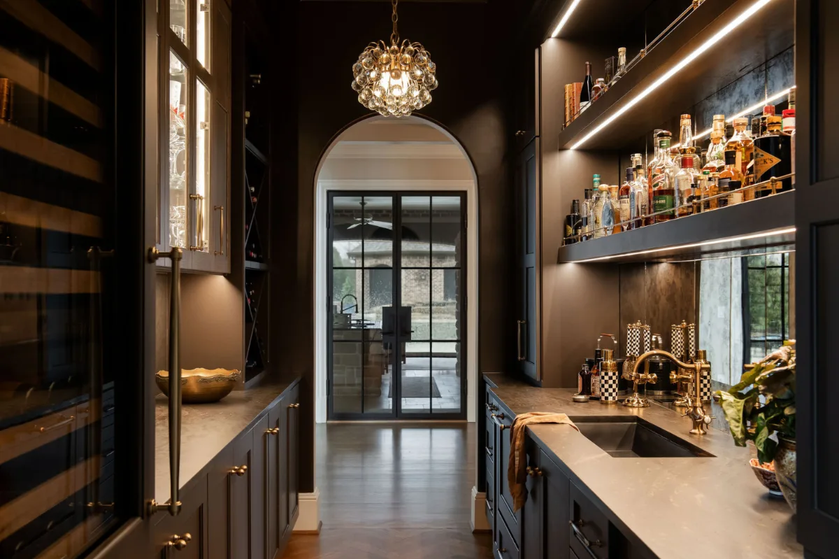
Matte black cabinetry and fixtures have moved beyond the ultra-modern kitchen and into a much wider range of design vocabularies across Franklin and Brentwood. In farmhouse, transitional and classic contemporary kitchens alike, matte black is appearing as a grounding element that provides strong visual contrast without reading as aggressive.
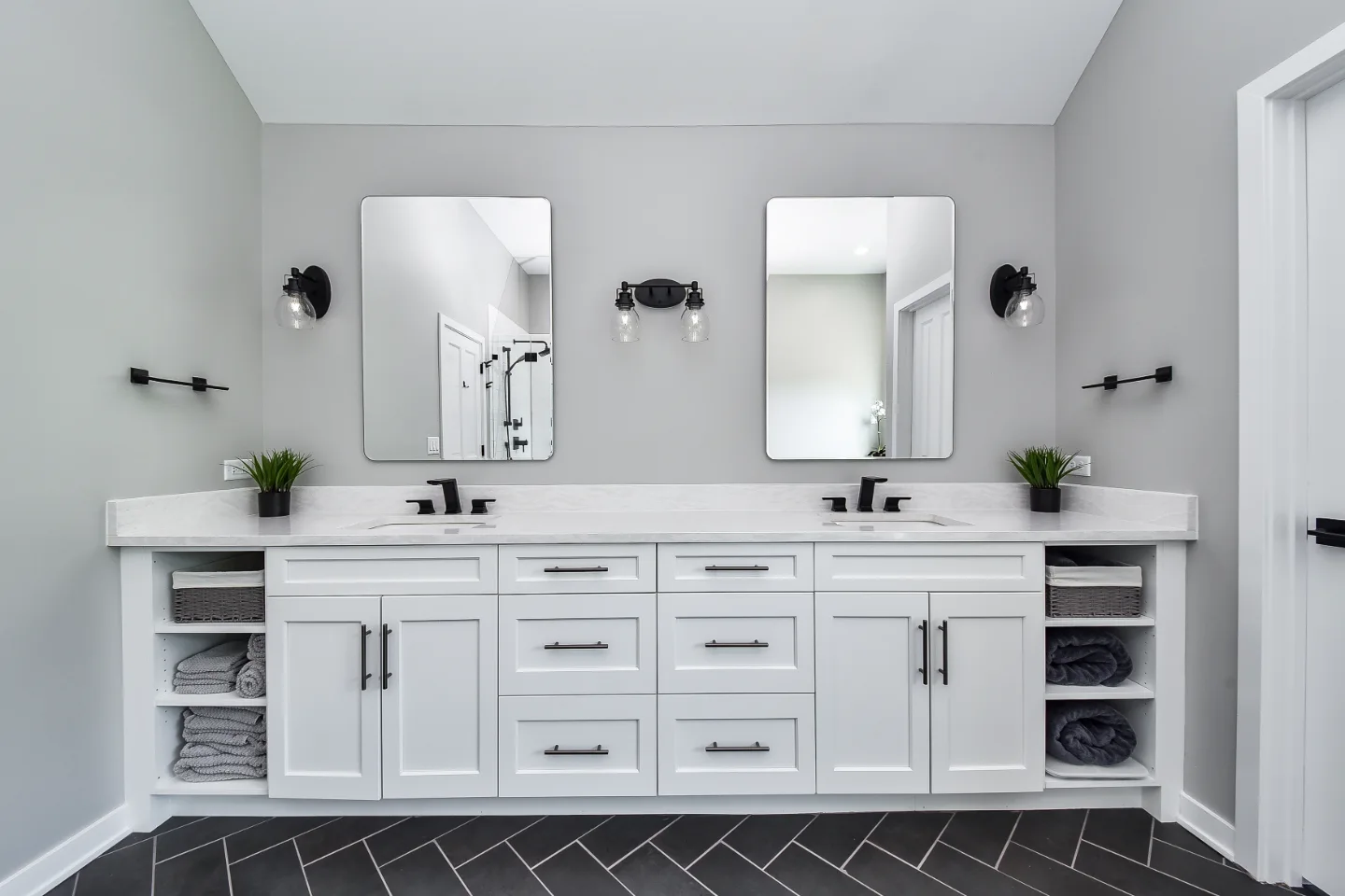
Used thoughtfully, black anchors a kitchen and gives it weight. It works best when the surrounding palette provides enough contrast and warmth to prevent the room from feeling heavy. White countertops, light wood accents and warm-toned hardware in unlacquered brass or aged bronze all help maintain balance when black cabinetry is the primary color.
Lighting is the most important consideration in a kitchen with significant black elements. Natural light during the day helps maintain the room's openness. Layered artificial lighting, including recessed ambient fixtures on dimmers, pendant task lighting over the island and under-cabinet LED strips, ensures the high-end kitchen features read as warm and functional at each hour rather than dark and enclosed at night.
6. Two-Tone Cabinets That Create Depth
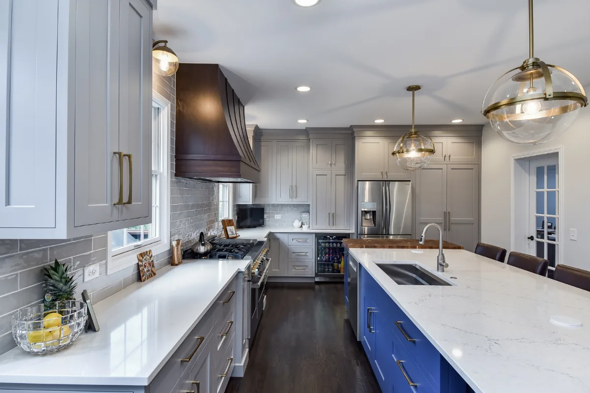
Two-tone cabinetry has become one of the most practically useful directions in kitchen color design because it allows a homeowner to introduce color with more control than a single-color commitment provides. Rather than choosing between a bold statement and a safe neutral, two-tone design allows for both simultaneously.
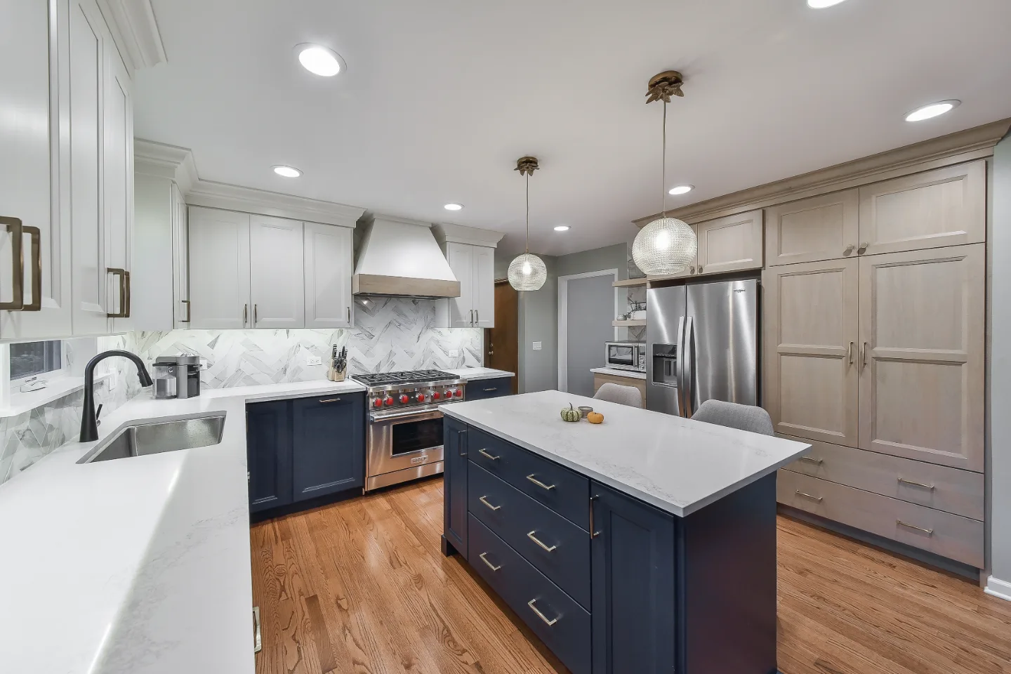
The most common approach in Williamson County kitchens is darker lower cabinets paired with lighter uppers. This follows the natural visual logic of a room: weight at the base, openness above. A deep forest green or ink blue lower cabinet run with warm white uppers produces a kitchen that feels layered and designed without reading as overwhelming.
A bold island in a contrasting color is the other popular variation. The surrounding perimeter cabinets remain in a neutral, while the island introduces the color story in a concentrated, contained way. This approach is particularly useful for homeowners who want to try a direction without committing the entire kitchen to it. The island can be updated as preferences evolve without requiring a full repaint. Our roundup of kitchen cabinetry design trends covers the door styles and finishes that pair best with each color direction.
7. Soft Pastels with a Modern Sensibility
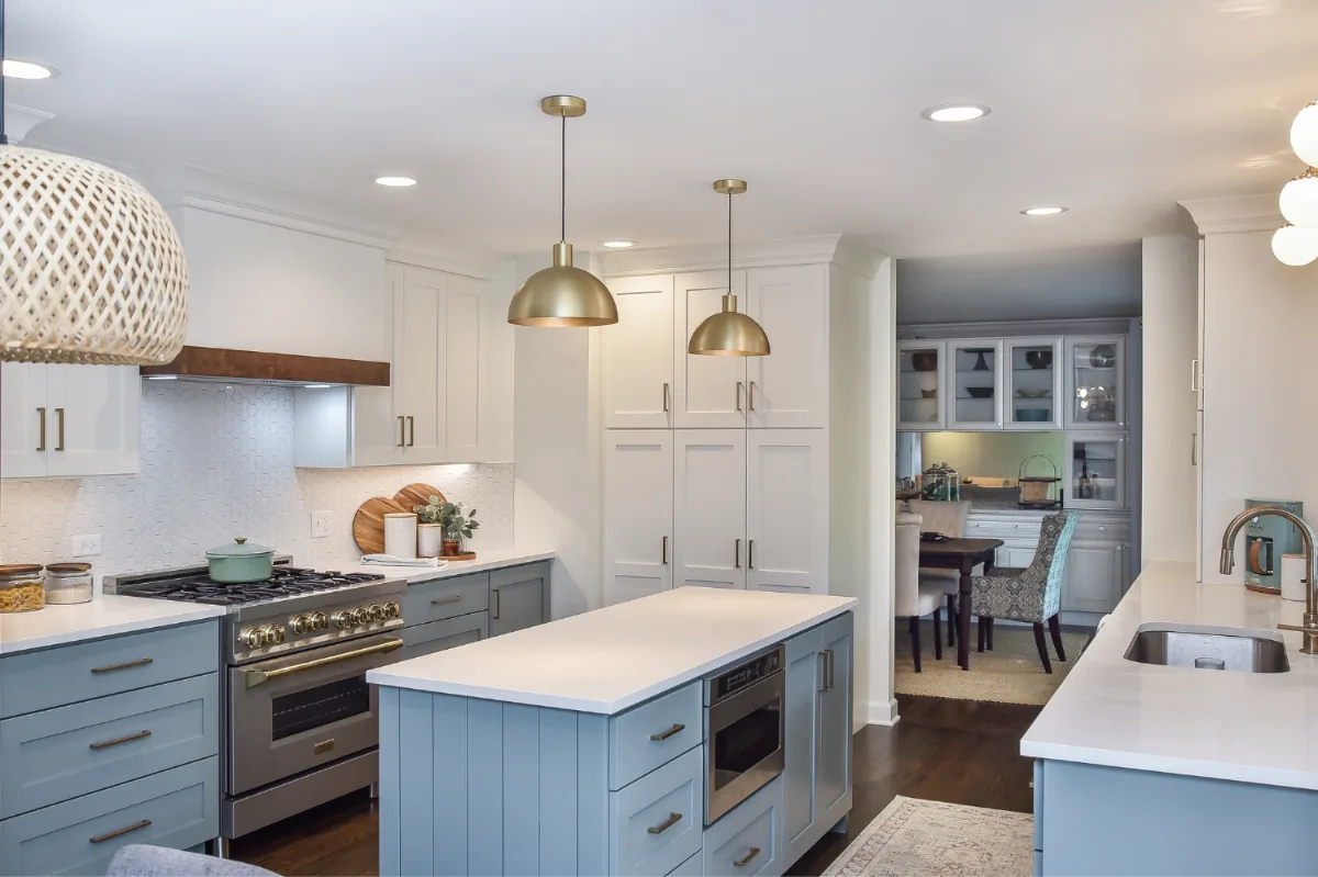
Pastels have returned to kitchen design in a form that is meaningfully different from their earlier appearances. The current version is muted, dusty and restrained: sage rather than mint, dusty blue rather than sky blue, blush rather than pink, pale clay rather than peach. These are colors that feel sophisticated rather than playful, which is precisely what makes them work in a serious kitchen design.
Soft pastels are particularly well suited to kitchens that prefer a light overall palette but want something with more character than white or off-white. They introduce a clear color identity without requiring the full commitment of a saturated tone. In a kitchen with clean Shaker-profile cabinetry in dusty sage, honed marble countertops and polished nickel hardware, the result reads as quietly distinguished rather than sweet or themed.
The key to making pastels work in kitchen design is pairing them with materials that have enough visual weight to anchor them: natural stone, warm wood accents, quality hardware in honest metals. Without those grounding elements, pastels can read as delicate rather than intentional.
8. Natural Wood Tones as a Primary Color
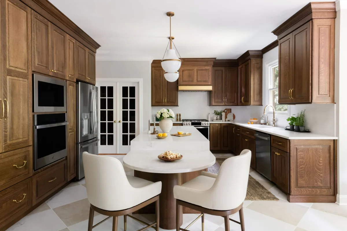
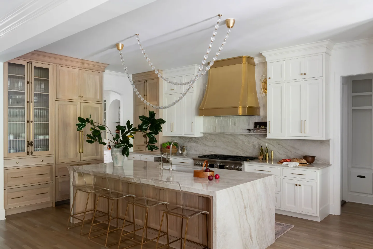
White oak, warm walnut and the full range of natural wood tones are appearing in Franklin and Brentwood kitchens not as accents or secondary elements but as the primary material that defines the kitchen's visual identity. From full cabinetry runs to island fronts, range hoods and open shelving, wood is being used at a scale that was less common a decade ago.
This reflects a broader shift toward organic materials and honest surfaces that develop character over time rather than requiring maintenance to stay pristine. A kitchen built primarily in white oak cabinetry with a lightly brushed finish reads as warm, grounded and permanently current in a way that painted finishes sometimes cannot match, because the wood's natural variation prevents it from ever looking sterile or uniform.
"The white oak kitchen is the one we are specifying most consistently right now in Franklin and Brentwood," says Bryan Sebring, CGR. "When the grain is right and the finish is honest, it ages better than anything else we put into a kitchen. Clients who chose it five years ago still feel like they made the right decision."
The most important design decision in a primarily wood kitchen is the countertop. A white or warm white honed stone, quartzite or marble provides the visual reset that prevents the room from reading as uniformly brown. Simple, restrained hardware in unlacquered brass or brushed bronze completes the palette without introducing unnecessary complexity.
9. High-Contrast Color Pairings
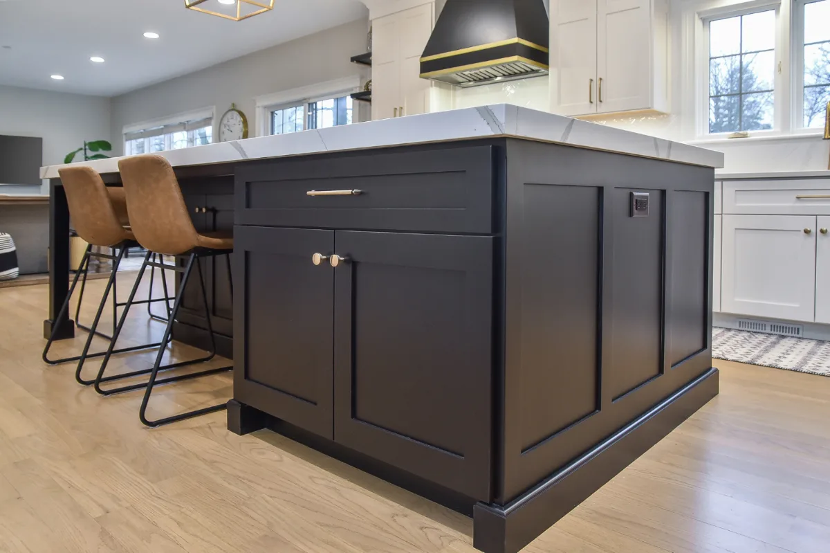
High-contrast kitchen palettes have become one of the more confident directions in current design, moving away from the single-tone approach and toward deliberate pairings of light and dark, warm and cool or saturated and neutral. The goal is kitchen layout ideas that read as dynamic and composed simultaneously.
The most successful high-contrast combinations in Williamson County kitchens are the ones that repeat each element purposefully throughout the space. If black cabinetry is one half of the pairing, black appears in the pendant fixtures, the hardware and perhaps the range. If unlacquered brass is the warm counterpart, it appears in the hardware, the faucet and the light fixture finishes. That repetition is what transforms a contrast into a cohesive design rather than a collection of competing elements.
Ink blue and warm brass, forest green and natural stone, charcoal and white oak, each of these pairings works because both elements are grounded in materials with genuine visual quality. The contrast is formal, not arbitrary and that distinction is what separates a kitchen that feels designed from one that simply feels busy.
10. Statement Islands That Lead the Color Story
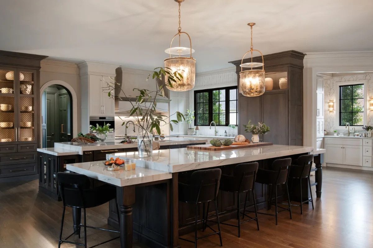
For homeowners who want to introduce a bold kitchen color trend without committing the entire room to it, a statement island is the most practical and flexible entry point. The island is the centerpiece of the kitchen by function and by position. Making it the centerpiece by color as well simply completes the logic. Our guide to kitchen island design trends covers the proportions and materials that make a statement island work as well as its color does.
A deep blue island surrounded by warm neutral perimeter cabinets. A forest green island in a kitchen where everything else is white oak and white stone. A warm terracotta island against painted white cabinetry and honed marble. Each of these combinations produces a kitchen that reads as layered and intentional rather than one-dimensional.
Statement islands also offer the practical advantage of future flexibility. Because the island represents a smaller portion of the total cabinetry investment, it is easier to repaint or refinish as the household's preferences evolve. This makes a bold island color a lower-risk way to engage with the current directions in kitchen design than a full-room color commitment would be.
How to Choose the Right Color for Your Kitchen
With ten compelling directions available, the most useful question is not which color trend is most current but which direction is most appropriate for a specific kitchen, a specific household and a specific set of long-term goals.
Natural light is the first filter. A kitchen with generous south or west-facing windows can absorb deeper, more saturated cabinetry colors without reading as heavy. A kitchen with limited natural light almost always reads better in lighter or warmer tones that reflect and distribute the available light rather than absorbing it.
The relationship between the kitchen and the adjoining living spaces matters in open-plan homes, as is common throughout Westhaven, Brentwood and Cool Springs. The kitchen palette does not need to match adjacent rooms, but it needs to be in conversation with them. A color transition that feels abrupt or disconnected from the living room visible beyond the kitchen interrupts the home's overall sense of coherence.
Material durability is a practical consideration that deserves as much attention as the aesthetic one. Darker matte cabinetry finishes show fingerprints more readily than lighter or textured surfaces. Some paint finishes are more washable than others. Choosing a color direction without considering how the finish will perform in daily use for fifteen years produces kitchens that look beautiful at completion and require more maintenance than expected over time.
Testing color in the actual space, at different times of day and under the artificial lighting that will be used in the finished kitchen, remains the most reliable way to evaluate a direction before committing. What reads as warm and inviting at noon in natural light can read as flat or orange under warm incandescent artificial light in the evening. That evaluation is an essential step, not an optional one.
Bringing It All Together
The most important takeaway from today's kitchen color trends is that the range of what is possible has expanded substantially. White kitchens remain beautiful and will continue to be specified in Franklin and Brentwood homes where they genuinely suit the household and the architecture. But they are no longer the default, and homeowners who want a kitchen with more personality, more warmth and more genuine character now have more well-considered directions to choose from than at any point in recent memory.
The most successful designs almost always combine more than one of these directions. A warm neutral palette with a deep green island and white oak accents. A matte black and white kitchen with unlacquered brass hardware threading through both. A wood-forward kitchen anchored by white honed stone and restrained by simple hardware. These layered combinations produce kitchens that read as composed and fully resolved rather than as an application of a single trend.
It is time that you love your kitchen from each angle, in each light and each day you use it. If you are planning a kitchen remodel in Franklin or Brentwood and want to explore which color direction will serve your home best, contact Sebring Design Build to schedule your complimentary consultation. Our designers work through the material palette and color direction as part of each kitchen plan, not as a separate decision made after everything else is already set.